

Ad creative that converts does four things in order: it stops the scroll (hook), names a problem or desire the viewer already has, shows proof that you solve it, and gives one clear next step (CTA). Design it for the phone first, in 4:5 for the feed and 9:16 for Stories and Reels, keep text out of the areas the app covers, and test meaningfully different concepts instead of tiny variations of one ad.
That's the whole game. The rest of this guide is how I actually do it, with examples from ads I've designed for Philly businesses, from home care and urgent care to motorsport and fine art.
Why creative matters more than ever
Meta's ad system now does most of the targeting on its own. In 2025, Meta said the focus has moved from niche targeting to creative diversification as the main way to find the right audiences, powered by a retrieval system it calls Andromeda that picks which ads are even in the running for each person.
In plain language: your creative is your targeting. The image, the words and the format tell the system who the ad is for. A brand running three ads that look the same is giving it one option. A brand running different concepts for different people gives it real choices.
The layout: hook, problem, proof, CTA
Every ad I design, static or video, follows the same structure. It's just compressed differently.
1. Hook
The first thing anyone sees. On a static ad, that's the headline and the main image working together. On video, it's the first frame and the first line. It should be readable in about a second. (I wrote a whole guide on hooks for Reels and TikTok.)
2. Problem or desire
Say what the viewer already feels: tired of waiting at urgent care, worried about a parent at home, bored of their walls. If the viewer doesn't recognize themselves in the ad, the rest doesn't matter.
3. Proof
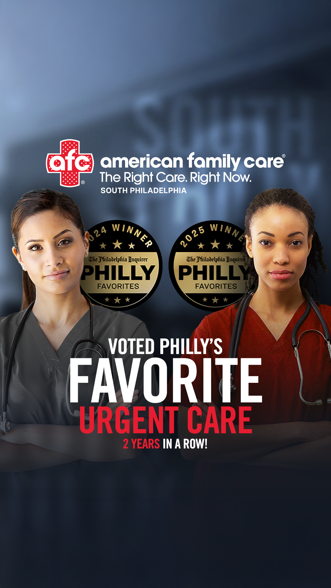
Why should they believe you? Real reviews, an award, a number, a before and after, a face, a product in use. Proof should be specific. "Voted Philly's Favorite Urgent Care" beats "great service."
4. CTA
One action. Book, shop, call, enter, claim. Put it on the creative and in the button, and make them match.
Static, carousel or video?
You don't have to pick one. The point of creative diversity is to give the system different formats for different people. Here's what each is best at:
Static images: fast to make, fast to test, great for a clear offer, a strong product shot or proof (an award, a review). Don't let anyone tell you statics are dead. A sharp static is often the cheapest way to find a winning message.
Carousels: best for showing range (several products), a process or a story in steps, or a before and after. The first card has to work as a static on its own. My carousel design guide covers the layouts.
Video: best for showing a product in motion, a person talking to camera, a transformation or anything that needs a demo. It needs a hook in the first second and should work with the sound off.
A good starting mix for a small brand is 2 to 3 statics, 1 carousel and 1 to 2 short videos, each built on a different angle.
Sizes and safe zones
Design for the placements people actually see:
Feed (Facebook and Instagram): 4:5 vertical (1080 x 1350). It takes up the most room in the feed. 1:1 still runs, but you give away space.
Stories and Reels: 9:16 full screen (1080 x 1920).
Safe zones: on 9:16, the app covers the top and bottom with the profile name, captions and buttons. A common rule is to keep text and logos out of roughly the top 14% and bottom 35% of the frame, with a little margin on the sides. Preview your ad in Ads Manager on each placement before it goes live.
Make a 4:5 and a 9:16 version of every ad, not one size stretched to fit both.
Design rules for ads that get read
One message per ad. If you have three offers, make three ads.
Headline in 3 to 7 words. Readable at a glance, big enough on a phone.
Real photos beat stock. People recognize stock instantly and scroll past it. Your product, your space, your people.
Faces and eyes. A real face, ideally looking at the camera or at the product, pulls attention.
Strong contrast. The ad is competing with everything in the feed. Bold color, a clean subject and a simple background win.
Brand early, not loud. Your logo or colors should be recognizable, but the hook comes first. Nobody stops for a logo.
Native, not polished to death. Ads that look like they belong in the feed often beat glossy brand ads. Match the energy of the platform.
Angles: how to make ads that are actually different
Creative diversity doesn't mean changing the button color. It means different angles, concepts or formats. Some angles to build from:
The offer: what you get and why now
The problem: the pain point, said the way the customer would say it
The proof: an award, a review, a number, a before and after
The person: a customer, an employee or the founder on camera
The product: a hero shot, a demo, details up close
The culture: a local or cultural moment your audience cares about
The comparison: you vs. the old way, before vs. after
The language: a version in the language your customers speak at home
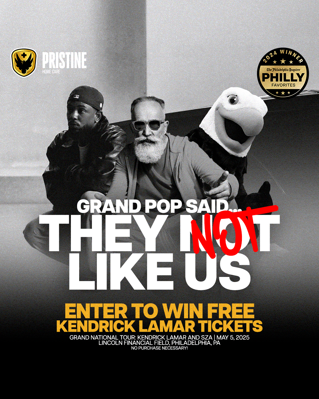
For Pristine Home Care, we ran a voting campaign, giveaways built on cultural moments and a Spanish-language version for the same audience. Same brand, very different reasons to stop scrolling.

A simple brief for every ad
Before I design anything, I fill in six lines:
Who is this for? One specific person, not a demographic range.
What do they want or worry about?
What's the one message?
What's the proof?
What's the one action?
What formats and sizes? (4:5 static, 9:16 video, carousel)
If a line is hard to fill in, the ad isn't ready to design yet.
How many ads to test
Test a few different concepts at once rather than one ad at a time. Meta used to recommend no more than six ads per ad set, and that guidance has since been dropped as its system got better at handling more creative. For most small brands, 3 to 6 meaningfully different ads per ad set is plenty to learn from without spreading the budget too thin.
Let each ad get enough impressions to judge. Then keep the winners, cut the losers and use what you learned to brief the next round.
What to measure
Hook rate (video): 3-second plays divided by impressions. Tells you if the start works.
Hold rate (video): how many watch to the middle or the end. Tells you if the story holds.
Click-through rate: tells you if the message and offer make people want more.
Cost per result: the number that actually matters to the business: cost per lead, booking, sale or entry.
A high hook rate with a low click-through rate usually means the opening works but the offer or proof doesn't. A low hook rate means fix the first frame before you touch anything else.
When to refresh ad creative
Ads wear out as the same people see them again and again. Signs it's time for new creative:
Cost per result keeps creeping up for a week or more
Click-through rate drops while frequency (how often each person sees it) climbs
Comments start to say "I keep seeing this"
The fix usually isn't a new color. It's a new angle. Keep your best concept running and add fresh ones from the list above so the system always has something new to try.
Ad creative FAQ
What size should Meta ads be?
Make a 4:5 version (1080 x 1350) for the feed and a 9:16 version (1080 x 1920) for Stories and Reels. Keep text out of the top and bottom of 9:16 so the app's buttons don't cover it.
Do static ads still work on Meta?
Yes. Statics are fast to make and test, and a strong one often finds a winning message faster than video. The best accounts run a mix.
How much text can I put on an ad?
As little as possible. A short headline and maybe one supporting line. If it needs a paragraph, it belongs in the caption.
How often should I refresh my ad creative?
When cost per result climbs and click-through falls while frequency rises. For many small accounts that's every few weeks, but let the numbers decide, not the calendar.
Should I use AI to make ad creative?
Yes, it's part of my own workflow: AI is great for concepts, quick variations and scenes you couldn't shoot. What still makes an ad work is a clear idea, real proof and a look that's yours, because the feed is already full of generic AI ads.
Can a local business compete with big brands on Meta?
Yes, and often better. Local proof (a Philly award, a neighborhood, a face people recognize) is something national brands can't fake.
Need ad creative that works?
I design static, carousel and video ads, and shoot the photos that go in them, for brands and local businesses in Philadelphia and beyond. See the ad campaigns I've made and my social media content page, or start a project.