

Playbook Media
Brand brief & logo
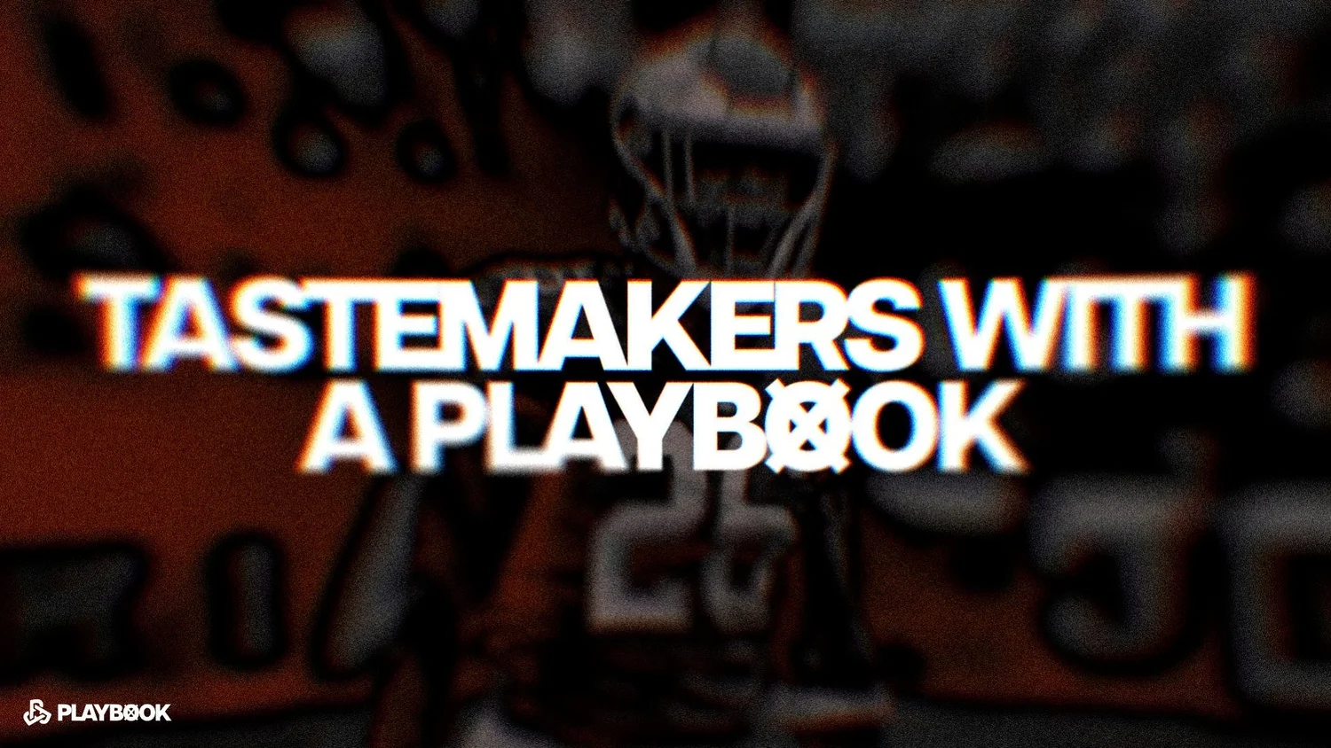
A brand brief and logo for Playbook Media, a content and campaign company that sells itself as tastemakers with access to the right rooms.
- Year
- 2026
- Role
- Designer
- Tools
- Illustrator, Photoshop
- Services
- Branding
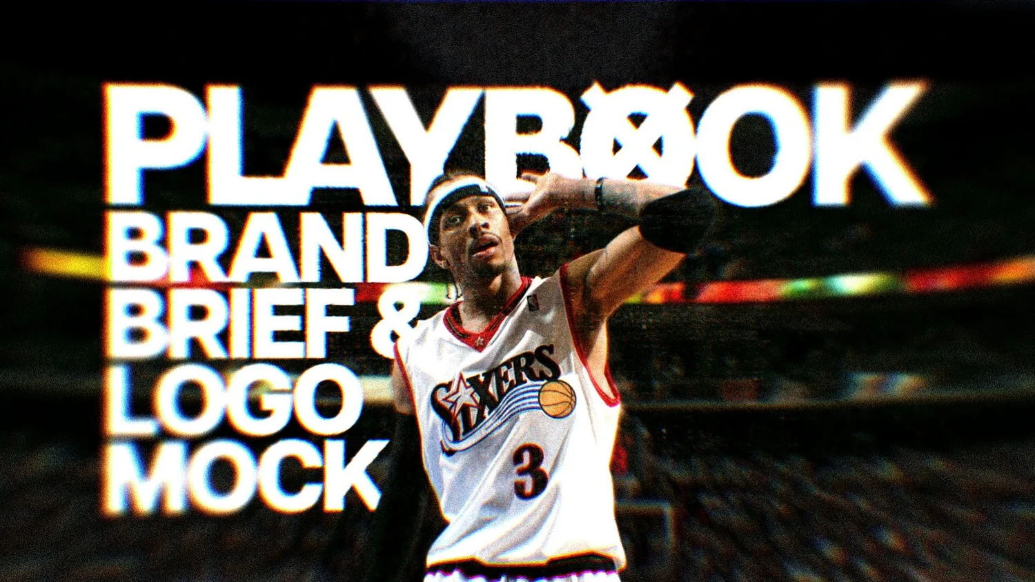
The brief
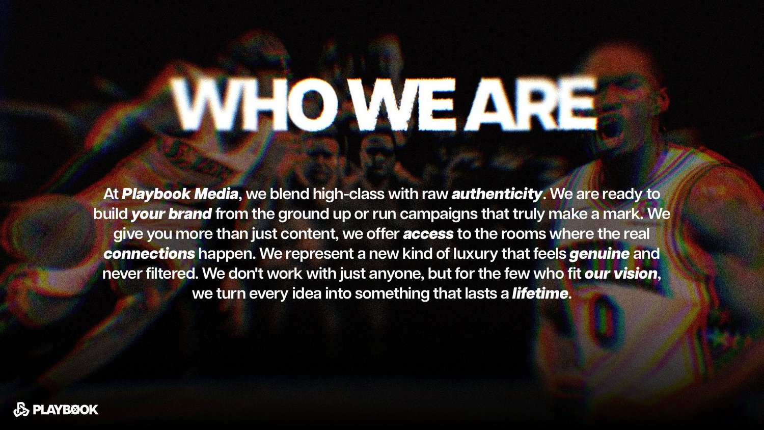
Playbook Media builds brands from the ground up and runs campaigns for a small list of clients. Their own pitch, written for the brief: high class mixed with raw authenticity, and a kind of luxury that feels genuine and never filtered. They needed a mark and a look that could carry that.
The mark
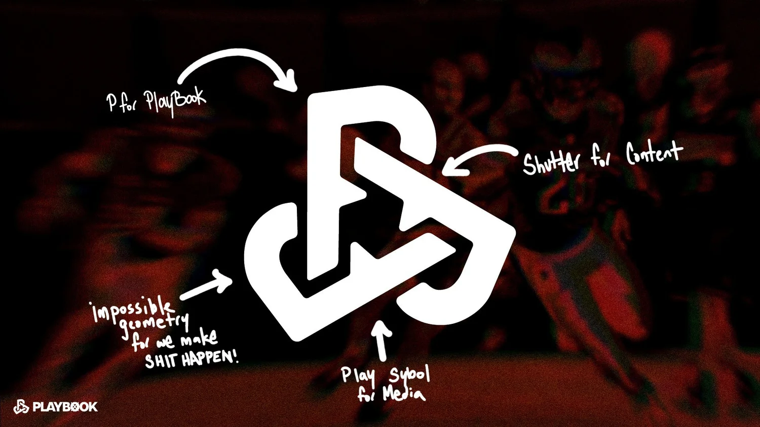
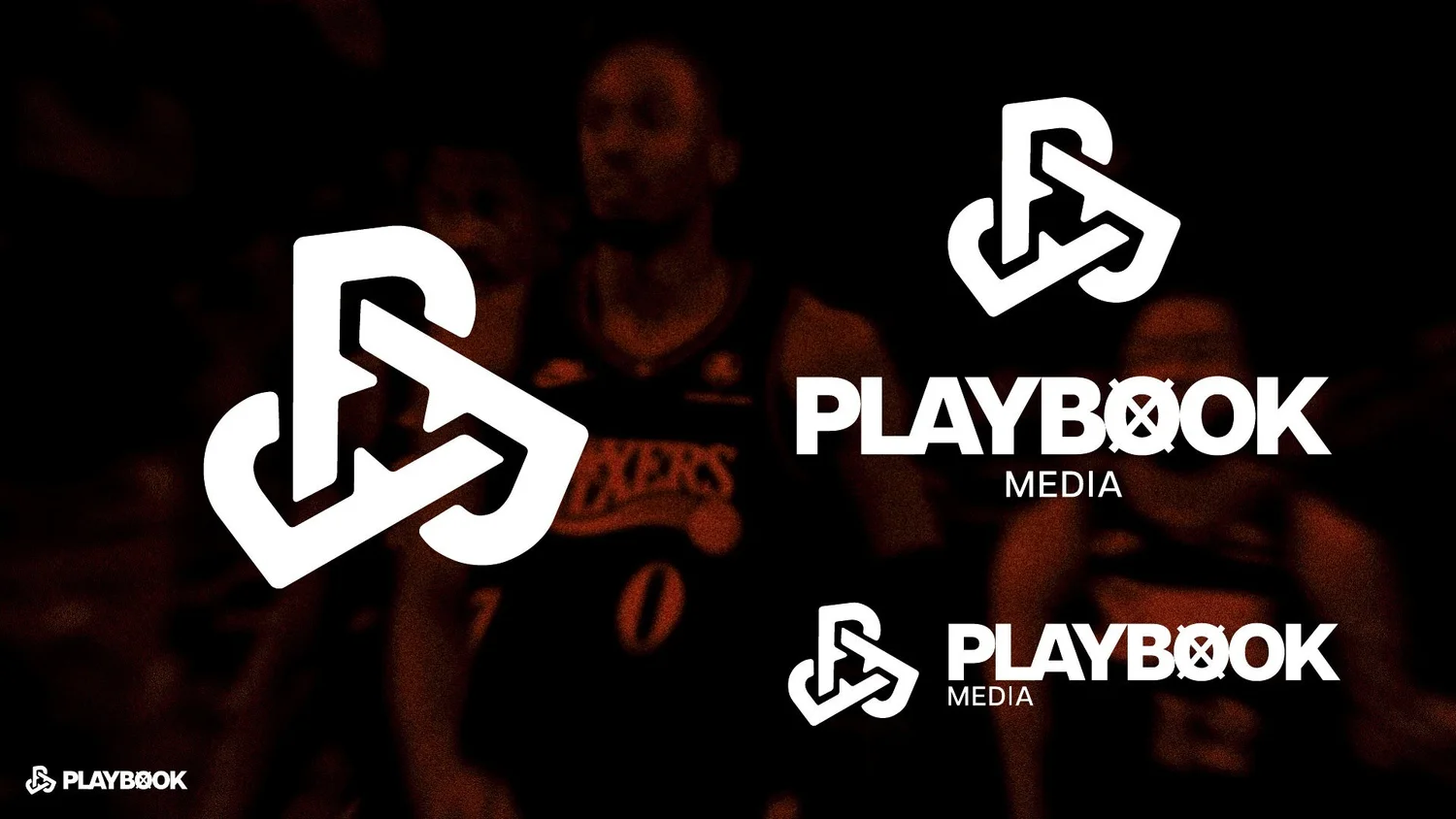
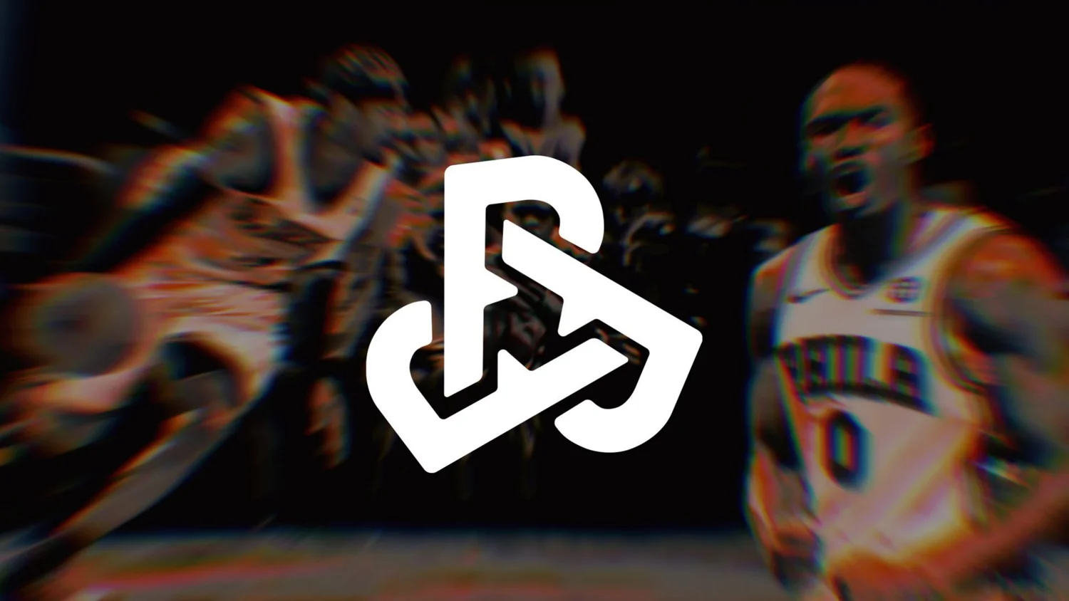
One shape, four ideas, all noted on the construction slide:
- A P for Playbook
- A camera shutter for content
- An impossible geometry loop for “we make it happen”
- A play symbol for media
It reads as a single bold knot at a glance. The ideas are there for anyone who looks twice.
The system
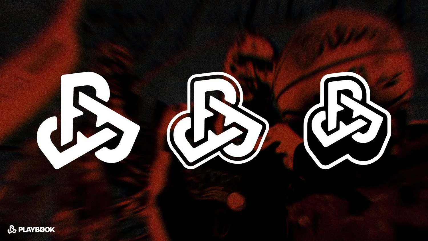
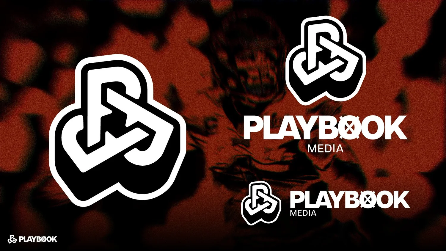
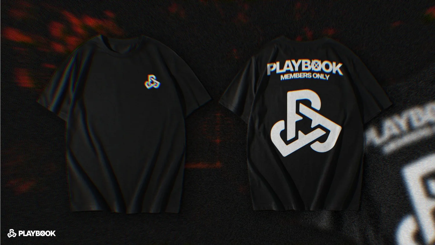
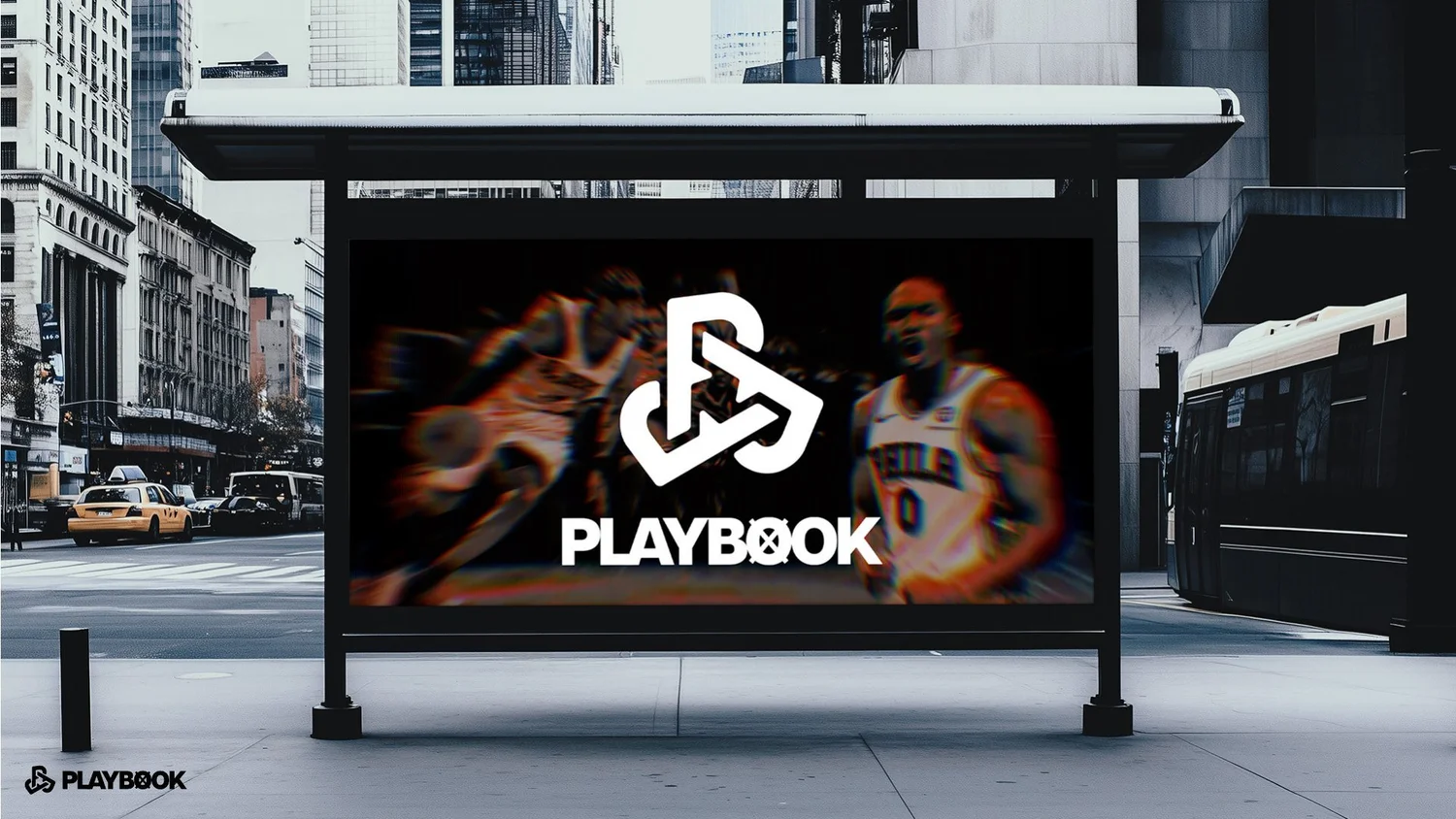
The brief shows the mark alone, stacked and horizontal with the PLAYBOOK MEDIA wordmark, and in outline and solid weights. Then it goes out into the world: a members-only tee and a bus shelter. Everything sits over grainy red-and-black basketball photography with motion blur, so the brand feels like courtside, not a corporate office.
What it shows
A logo can carry a lot of meaning and still look simple. That’s the balance I aim for in every logo design and brand identity project.
Related reading