

A good graffiti sticker (a "slap") does one thing: it's instantly readable from a few feet away. Design it around one bold idea, either a name in graffiti letters or a character, with thick outlines, a limited palette and a simple shape that fills the sticker edge to edge. Hand-drawn slaps are traditionally done on blank shipping labels. Printed slaps start as a digital design and get printed on vinyl or eggshell sticker paper.
Before the brands and the screens, I was a graffiti sticker artist in Philadelphia. I drew characters by hand on blank labels, one at a time, and the character I kept coming back to was Derp: a long droopy head, bug eyes and something always dripping. Here's what years of drawing slaps taught me about designing them.
What is a slap?
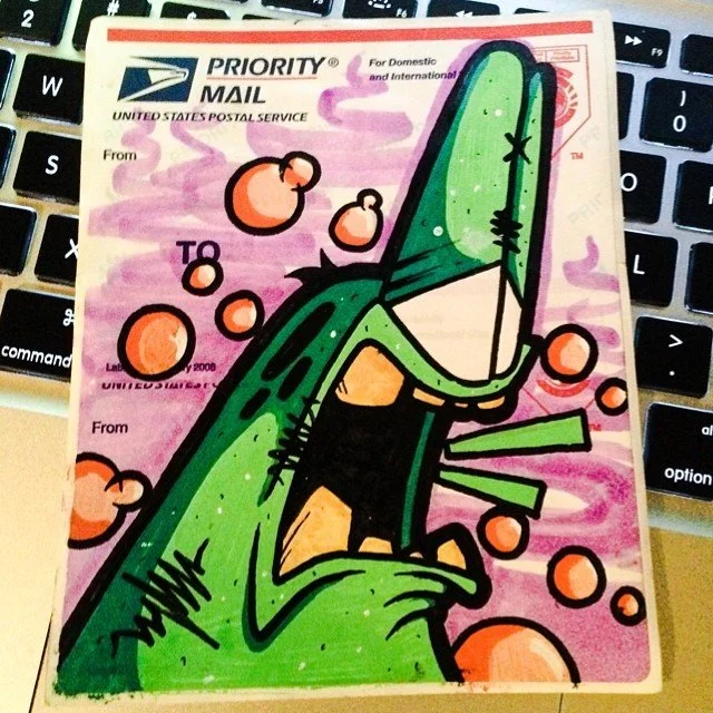
"Slap" is sticker-culture slang for a graffiti sticker. The classic slap is a Label 228, the blank USPS Priority Mail shipping label. Writers have drawn on them for decades because they're sticky, tough and the perfect size for a quick piece. Today slaps also include printed vinyl stickers, eggshell stickers and die-cuts.
One note: Label 228s are made for mailing Priority Mail packages. If you're designing stickers to sell, hand out at shows or put on merch, design for printed blank labels or vinyl instead. You get the same look, and you can print as many as you want.
Step 1: Pick one idea
Every great slap is built on one thing:
A name in graffiti letters: a tag, a throw-up or a short handle.
A character that becomes your signature, like Derp.
A combo: a character holding or sitting on your name.
Don't try to fit both a long name and a detailed scene on one small sticker. Pick the one thing you want people to remember.
Step 2: Design for the size
Most slaps are small, and people see them in passing. That changes how you draw:
Thick outlines. A heavy black outline holds the design together and keeps it readable at a distance. This is the single biggest difference between a sticker that pops and one that disappears.
Big, simple shapes. Fine details turn to mush at sticker size.
Fill the space. Let the design run close to the edges. Lots of empty label looks unfinished.
Exaggerate. Bigger eyes, longer drips, fatter letters. Stickers reward going too far.
Drawing characters small enough for a sticker is how I learned to keep shapes bold and ideas instantly readable. It's the same thinking behind a good logo.
Step 3: Build a character people recognize
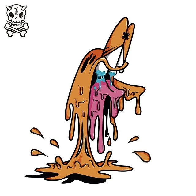
If you go the character route, make it repeatable. Derp melted, smoked, got skinned and grew tentacles, but you always knew it was him, because the core stayed the same:
A signature silhouette. Derp's long droopy head reads even in a tiny thumbnail.
One or two signature features. Bug eyes and something dripping.
A consistent outline weight and style.
Once those are locked, you can change the mood, the color and the situation on every sticker, and it still builds one recognizable character over time. That's also how a mascot logo works. I go deeper on that in graffiti logos.
Step 4: Keep the color limited
Two or three colors plus black and white is plenty.
Pick one loud color for the character or letters (orange, green, red, cyan).
Use a contrasting background so the subject pops.
Add drips, slime or smoke in a second color for movement.
Leave white highlights on the eyes and letters. They make the art feel shiny and alive.
If you're printing, limited color also keeps the design clean and saves you fighting with color shifts.
Step 5: Hand-drawn or digital
Hand-drawn slaps are one of a kind. Markers on blank labels give you that raw, scribbled feel no printer can fake. The downside is that you make them one at a time.
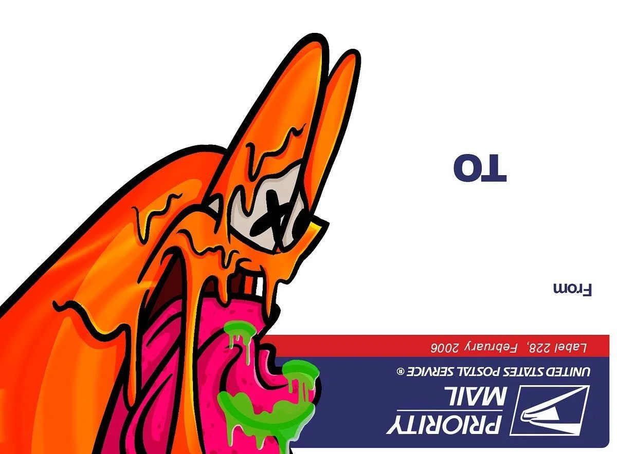
Digital slaps scale. I redraw characters in Procreate now, sometimes right on top of a scan of an original label, so the marker feel and the label shape carry into the digital version. That's the best of both: the hand-drawn look, ready to print by the hundred.
Step 6: Get the file ready to print
If you're printing your own slaps:
Size: design at the exact size of your label or sticker stock. Printed slaps are often 3 to 4 inches on the longest side, and die-cuts can be any shape.
Resolution: 300 DPI at the final print size.
Bleed: extend the background about 1/8 inch past the cut line so there are no white edges.
Cut line: for die-cuts, add a white border around the art and give the printer a clean outline path.
Material: vinyl lasts outdoors and handles weather. Eggshell paper is the classic graffiti sticker stock: it breaks into small pieces when someone tries to peel it, so it's popular with writers. Pick vinyl for merch and giveaways.
Step 7: Make it a pack
One design is a sticker. Five designs that clearly belong together is a pack, and packs sell. Keep the same outline weight, character and color logic across all of them, and change the pose, mood or slogan on each. That's how I sold sticker packs back in high school, and it's still how I'd build a set for a brand today.
Sticker design mistakes to avoid
Thin lines that disappear from a few feet away.
Too much text. One word or name is plenty.
Low contrast between the subject and the background.
Low-resolution files that print blurry.
No bleed, which leaves white slivers at the edges.
A different style on every sticker in a pack.
Stickers for brands
The same rules work for businesses. A slap-style sticker with a bold character or a graffiti version of your name gets kept, stuck on laptops and shared, which is free advertising. I've designed stickers for brands like Triple Eight Auto and Cafe Vu alongside their logos and merch.
If you want stickers for your brand, crew or band, see my graffiti sticker art, custom lettering and merch design work. For the lettering side, read how to draw throw-up letters.
FAQ
What is a Label 228 sticker?
Label 228 is the blank USPS Priority Mail shipping label. Graffiti writers have drawn on them for decades because they're sticky, tough and the perfect size for a quick piece, so "Label 228" and "slaps" became sticker-culture shorthand.
What size should a graffiti sticker be?
Label slaps are a standard shipping-label size, and printed slaps and die-cuts are often 3 to 4 inches on the longest side. Whatever you pick, design at the real size so you can see whether the lines are thick enough.
What's the best material for printed stickers?
Vinyl for anything that lives outdoors or goes on laptops and water bottles. Eggshell sticker paper for the classic graffiti feel.
Should I draw by hand or design digitally?
Both work. Hand-drawn stickers are one of a kind. Digital lets you print as many as you need. A hybrid, like redrawing a scanned hand-drawn sticker in Procreate, keeps the raw feel and makes it printable.
Can you design graffiti stickers for my business?
Yes. I design sticker sets, die-cuts and slap-style stickers for brands, shops, artists and crews, including the lettering and characters on them. Start a project.