

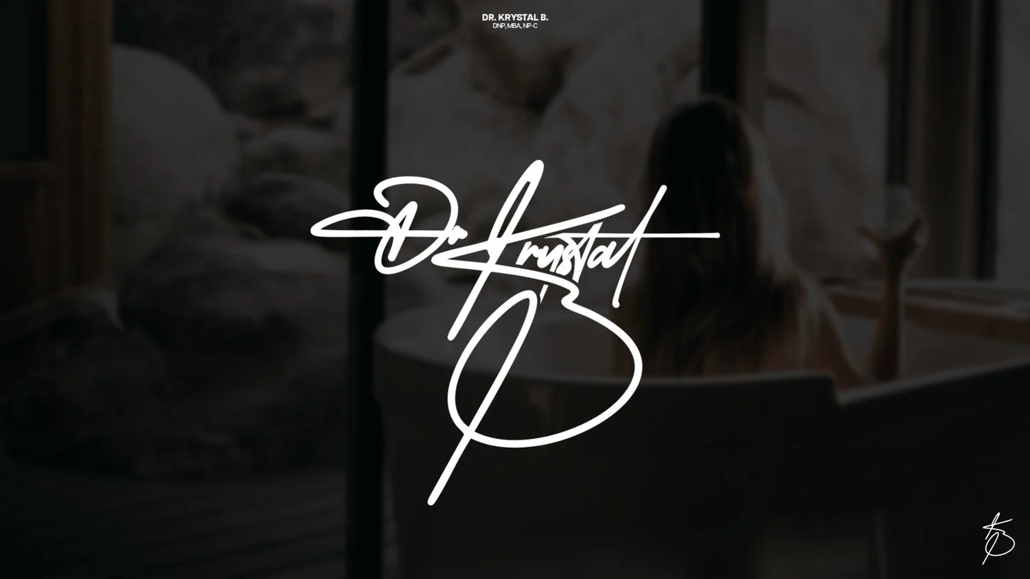
A signature logo is a logo drawn to look like a handwritten signature. It's the right choice for personal brands, where the person is the product: doctors and practitioners, coaches, artists, photographers, stylists and creators. To make one work, it needs three pieces: the full signature for big spaces, a monogram for small spaces like profile photos, and a plain typed name for places where script would be hard to read.
I recently designed a signature logo and monogram for Dr. Krystal B. Here's how I think about signature logos, with that project as the example.
When a signature logo is the right choice
A signature logo says "a real person stands behind this." That's powerful when:
You are the brand. Clients are choosing you, not a company.
Trust is personal. Health, beauty, coaching and creative services, where people want to know who they'll work with.
The look is premium or intimate. A signature feels hand-made and one of a kind.
It's usually the wrong choice when:
The business is bigger than one person, or will be one day.
The name is long or hard to read in script.
The logo needs to work at tiny sizes all the time, like an app icon, without a backup mark.
The three pieces of a signature system
A signature alone isn't enough. Script gets messy when it's small. So a signature logo should come as a small system:
The full signature. For the website header, social banners, business cards, packaging and anywhere it has room to breathe.
A monogram. Initials drawn in the same hand, for profile photos, favicons, stamps, watermarks and the corners of content.
A plain wordmark. The name in clean type for places that need to be read instantly: legal documents, small print, forms.
For Dr. Krystal B, that meant the flowing Dr Krystal B signature, a KB monogram and a clean DR. KRYSTAL B. wordmark.
How I design a signature logo
1. Start with real handwriting energy
A signature logo should feel written, not typed. Whether it's based on the client's actual signature or drawn from scratch, the strokes should have pen movement: thick and thin, a natural slant, a confident start and finish. Fonts that imitate handwriting rarely get there, because every letter repeats the same way.
2. Make the name readable first
The signature can be loose, but the name still has to come through. I check it at a glance: can someone who's never seen it read it in a second? If not, I simplify the letters that lose the most, usually the capitals.
3. Add one signature flourish
One flourish gives a signature its personality: a long underline, a looping capital, a crossed stroke that sweeps through the name. The Dr Krystal B signature has a long underline stroke running under the name. One flourish is a style. Three is noise.
4. Explore the monogram widely
The monogram is where most of the exploration happens, because initials are hard to make distinctive. For the KB monogram I drew a full round of options, from loose script to blocky serif, before picking the final one.
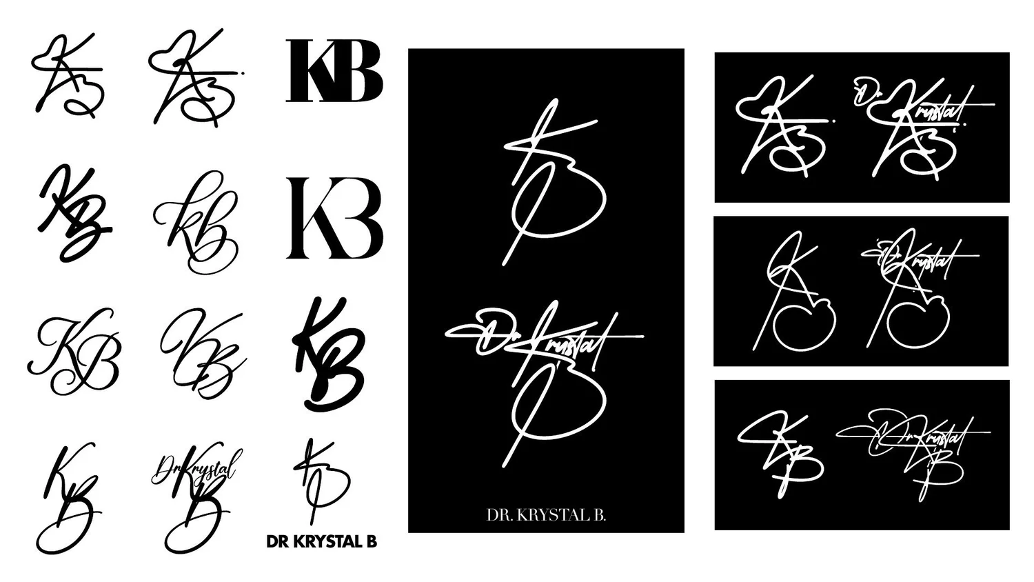
The final monogram keeps the same pen stroke as the signature, so the two feel like one hand wrote them. That's the key to a signature system that holds together.
5. Test it small and on photos
Signature logos often sit on top of photography. Test the signature and monogram:
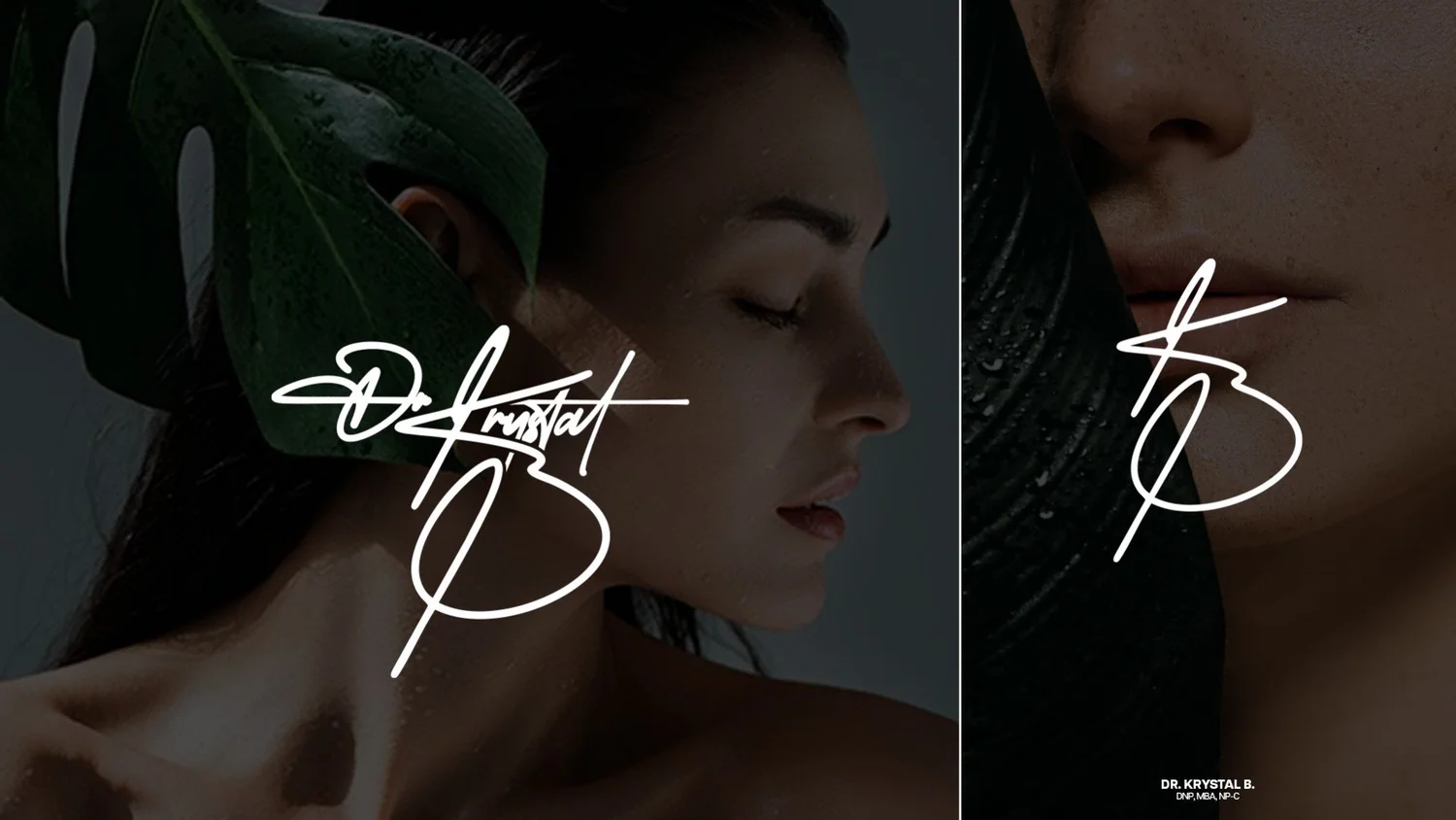
On light and dark photos. White over dark images is often the cleanest, as on the Dr. Krystal B lifestyle mockups.
At profile-picture size. If the full signature turns into a scribble, that's the monogram's job.
In one color. Signature logos should work in solid black and solid white.
Signature logo mistakes
Using a script font as-is. It looks generic, and everyone else can use the same font.
Too many flourishes. The name gets lost.
No monogram. The signature has nowhere to go at small sizes.
Thin strokes that break up when printed small or embroidered.
Low contrast when placed over photos.
Signature logo vs. script logo vs. monogram
Signature logo: looks like a personal handwritten signature, usually one person's name.
Script logo: any logo in flowing script lettering, often for a business name (think classic soda or bakery logos).
Monogram: just initials, often used as a secondary mark or for luxury brands.
A strong personal brand usually uses the signature as the main logo and the monogram as the secondary mark.
FAQ
Can I use my real signature as a logo?
Yes, and it can be a great starting point. A designer will usually clean it up, balance the letters, improve readability and redraw it as a vector, so it works at every size.
Is a signature logo professional?
Yes, for personal brands. It reads as personal and premium. For a larger company or a name that's hard to read in script, a wordmark or symbol is usually the better choice.
Do I need a monogram with a signature logo?
Almost always. Profile photos, favicons and watermarks are too small for a full signature. A monogram drawn in the same hand fills that gap.
What file formats should I get?
Vector files (SVG, AI or EPS) plus PNGs with transparent backgrounds in black and white. My designer files guide explains which to use where.
Can you design my signature logo?
Yes. I design signature logos, monograms and full personal-brand identities. See the Dr. Krystal B project, my custom lettering and logo design work, or start a project. For the difference between a logo and a full identity, read logo vs brand identity.